
Informing the public is at the heart of our mission at Pew Research Center. Everything we publish, even complex subject matter, should be accessible to a general audience. My colleagues and I on the Center’s communications team work closely with our research and editorial counterparts to ensure that reports, blog posts and other analyses stay true to the data while also making sense to readers who may not be well-versed in research specifics.
Here are some tips we’ve learned about how to communicate technical content to a wide audience:
Avoid jargon whenever possible. Define any technical terms that are used.
Avoiding jargon is always a good idea. But sometimes using technical terms is unavoidable. If readers need to know a new phrase or two to understand our research, we often define the term in the text itself.
Here’s a recent example from a blog post about energy usage in the United States, in which we tried to explain the meaning of “British thermal unit” in way that was easily understandable.

If there are many words or phrases like this, we sometimes include a glossary of key terms. Here’s an example from a study examining partisanship in press releases and Facebook posts issued by members of the 114th Congress. In this case, the terms in question are the definitions we used for lawmakers’ statements:

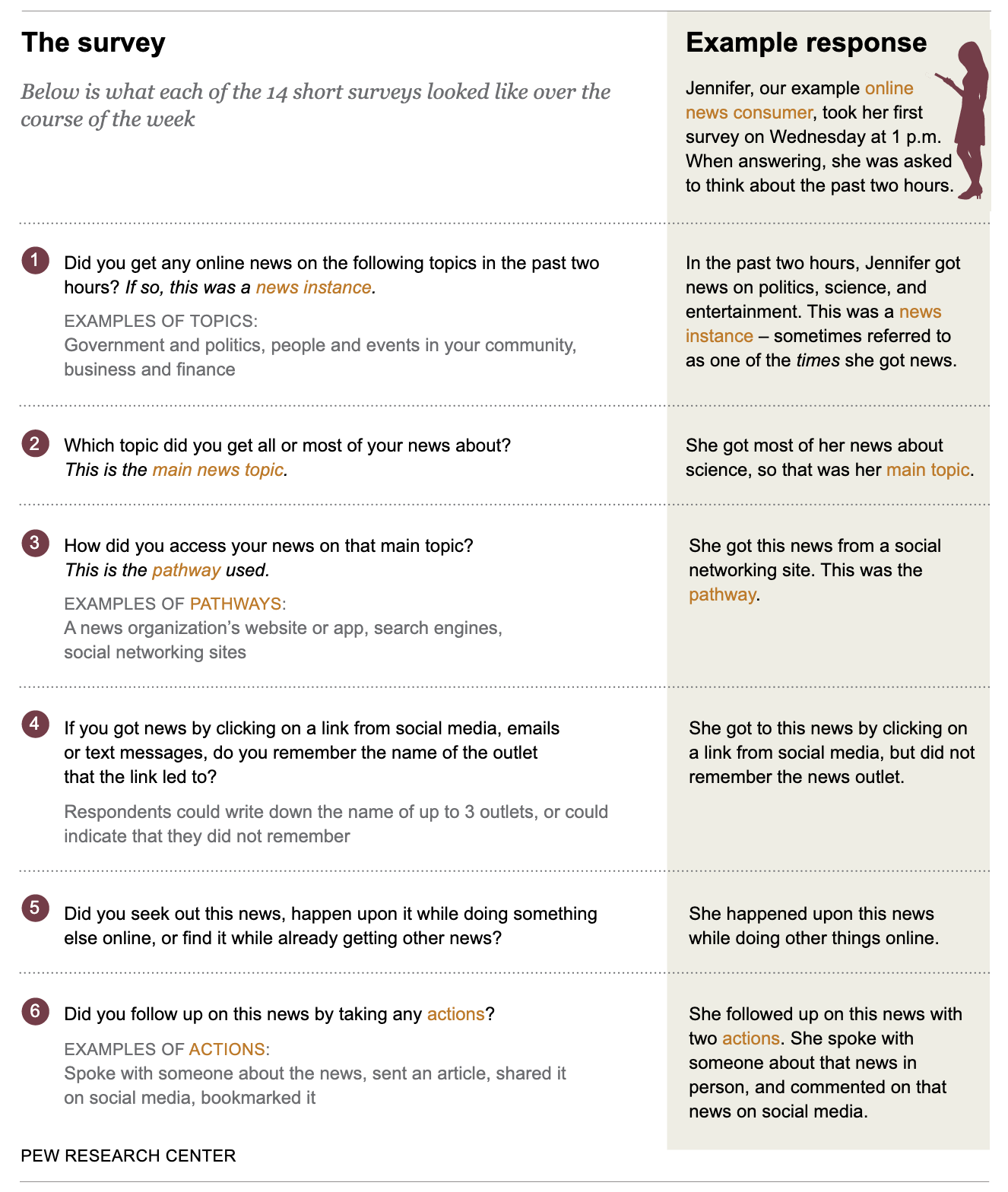
Words aren’t the only way to describe a complicated concept. We often use visuals like infographics or videos, too. For example, to understand a 2017 study on how Americans encounter, recall and act upon digital news, readers needed to know how we defined specific measures like “pathway,” “news instance,” “main news topic” and “action.” To explain these concepts (and to illustrate how exactly we implemented this complex survey), we created an infographic that walks readers through the terms and how they relate to each other, as well as the specific questions asked:
Similarly, our Methods 101 video series takes technical terms — like “mode effects” or “nonprobability surveys” — and boils them down into simple, easy-to-follow narratives:
Anticipate and prepare for detailed questions from your audience.
Before releasing a research report, our communications team works with the main authors to think through and practice answering questions we’re likely to get from journalists, academics, researchers and members of the public. We prepare not only for obvious questions (“Why did you conduct this research?” or “What were the report’s main findings?”) but also for far more technical questions (“How exactly did you build this algorithm?” or “What process did you go through to train your model?”)
We also discuss the elements of each project that might confuse readers. If a report is complex enough, we might preemptively publish a companion explainer piece. For example, when we published a 2018 report about the prevalence of bots on Twitter, we simultaneously released this video, detailing the process we used to identify Twitter accounts that were likely to be automated:
Explainer pieces can also take the form of a written Q-and-A with a lead researcher, like this one, in which Director of Journalism Research Amy Mitchell explained the methodology behind a 2018 report exploring whether Americans could tell the difference between factual and opinion statements in the news. Having these explainers available on the same day we publish complex research projects allows us to get out ahead of many common questions we might receive.
Be open about your methodology, and acknowledge when you are using new methods.
We always publish a methodology section as part of our research reports. And we’ve recently expanded on this practice by adding a “How we did this” box to all of our analyses, including blog posts. The box is intended to provide basic information about the methods we used in a short, easily understandable format for regular readers. Here’s a recent example that explains the fundamentals of how we conduct surveys through our American Trends Panel:

Being transparent about methods is especially important when dealing with new kinds of research. We’re continuously looking to do innovative research — and innovation often requires experimentation. This might take the form of a new research technique, a new data source or even using new platforms to disseminate our findings.
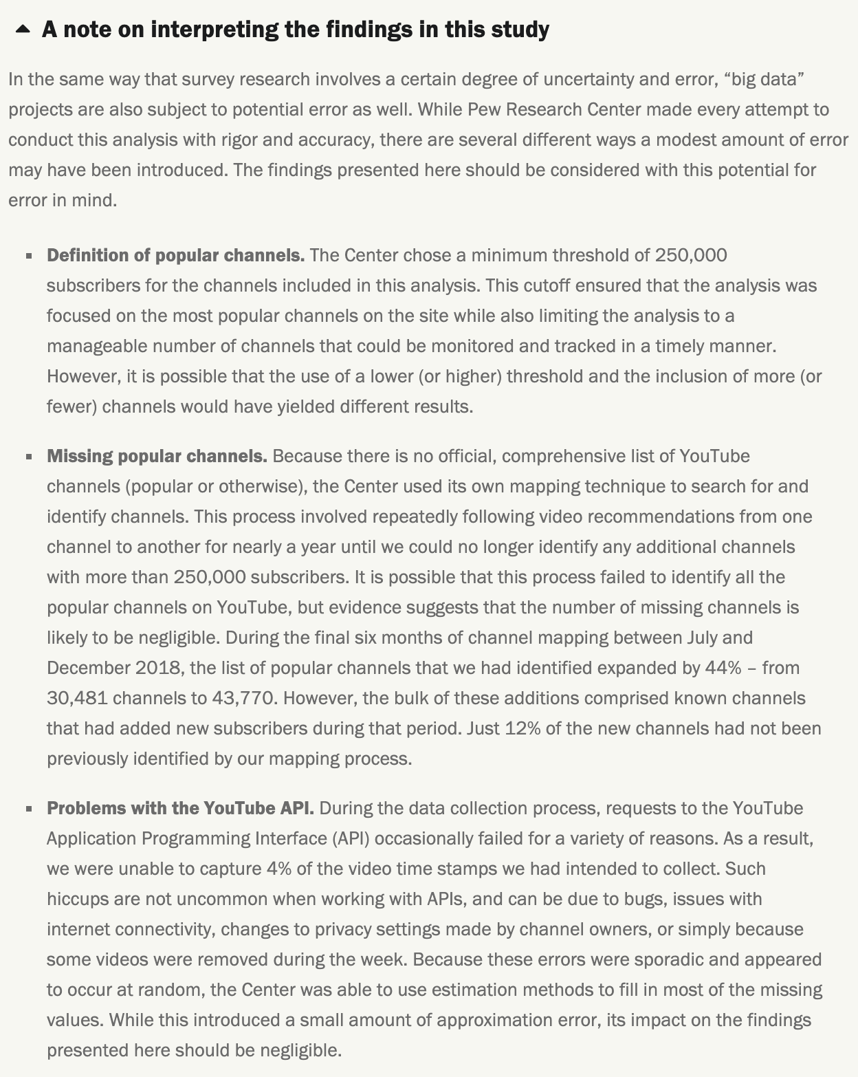
Whenever our research is exploratory, we signal to our readers that we’re trying something new. One way we do that is by being as transparent as possible about caveats and uncertainties related to our findings or methods. For example, our 2019 report about a week in the life of popular YouTube channels included a note on how to interpret the findings in the study:
Being clear and up-front about limitations or uncertainty in our experimental work facilitates transparency, one of our core values. When it comes to using newer methods, stating what we don’t know can be just as important as stating what we do. For example, when we studied bots on Twitter, we framed the findings around what were “likely to be bots,” given that we couldn’t know for sure. At the same time, we don’t want to focus on limitations to the point of apologizing for trying new things.
With that in mind, we always tell our audiences what they can take away from our work. For example, after listing several limitations of our computational analysis of online sermons, our report stated that the nearly 50,000 sermons we collected “offer a window into the messages that millions of Americans hear from pulpits across the country.” It went on: “The view is limited and does not come close to revealing all the meaningful communications between American clergy and their congregations, but it is an attempt to look systematically and objectively at a large portion of those communications.”
Not all platforms lend themselves well to technical content.
What resonates in a long-form report — where there’s enough space to include a host of background information and methodological details — may not work in a tweet, where space is extremely limited and findings can be taken out of context (and shared widely in just a few seconds!). When we do communicate about highly technical content on Twitter, we often do so in a thread that contains multiple tweets and links. In other cases, our findings are too nuanced to work on social media at all.
For all of our published materials, we work closely with our researchers and social media team to develop strategies for promoting our content through the appropriate channels. And we always strive to meet our readers where they are (including here on Medium). For example, certain elements of our work might be of greatest interest to our methods audiences, who care deeply about the nuts and bolts of how we do what we do. To reach that particular audience, we created a methods-specific Twitter feed, @pewmethods. That niche audience is also who we had in mind when we created this blog, Decoded. It gives us a place to provide a look under the hood for practitioners looking to understand the “how” behind our research.
Do you have a question for our communications team? You can email info@pewresearch.org, visit our media resources page or leave a comment below.